
 Sign In

The Wardrobe Architect Week 5: Your color story
The Wardrobe Architect is a popular series that ran in early 2014. It’s currently being expanded (with help and feedback from you) into a comprehensive toolkit. You can read all the posts here. If you want to give feedback and get first access when the toolkit is finished, enter your email:
Color is an extremely powerful force in our lives.
Color affects our mood. It affects how food tastes to us. It affects how and what we buy. The color of the pills we take can even affect the efficacy of the medication within. That is what a powerful psychological effect color has over us.
Not only is color a potent communication tool, but it’s also a nuanced one. We are capable of perceiving a huge number of colors, each one arousing a slightly different feeling in us.
Perhaps you can’t articulate why a certain shade of apricot feels good to you, but a slightly yellower shade does not. Somewhere deep within your mind, a combination of biology, culture, and context makes that decision before you are even aware of it.
It creates a visceral, physical response that you experience as emotion.
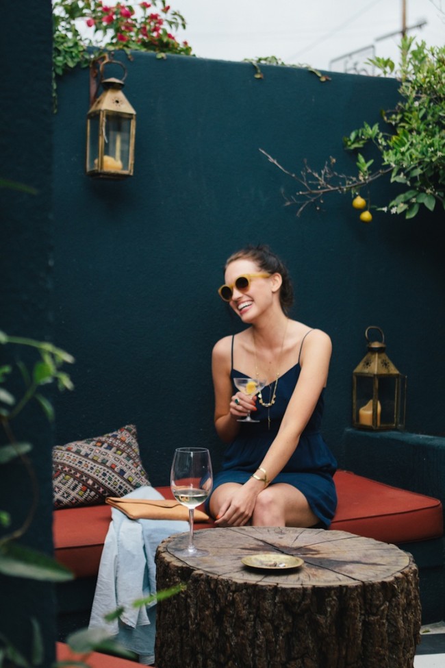
[image: pennyweight]
Color is a language
Designers and artists use color as a language to tell a visual story. Because of it’s variety and emotional impact, it’s an extremely effective tool.
You can do the same thing. By developing a palette, you create an outward expression of the moods, feelings, and reactions that you want to convey. And those feelings are unique to who you are, because no one experiences color in exactly the same way you do.
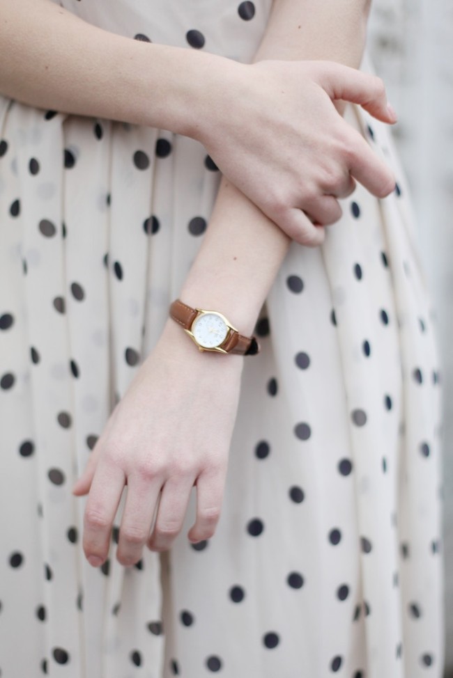
[image: The White Pepper]
There are a lot of systems out there for finding out which colors suit you, the most well-known being the Color Me Beautiful system of seasons that advises specific palettes depending on your coloring.
If these systems are helpful for you, I think that’s great! I know some people swear by this, and I’m sure it’s very helpful.
But for my part, I think color is too subjective and emotional to leave to anyone else’s preferences. I don’t care what supposedly suits me as much as I care how I feel in and around a color. Because color has so much power over our moods, I’d rather create those moods for myself.
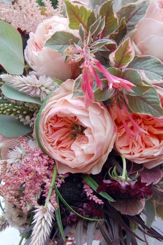
[image: The Designers Co-op]
Your color story
Today, I want to focus on your feelings about color.
Undoubtedly, there are colors that you feel naturally drawn to. Some colors just make you happy, some feel exciting, others make you feel calm and peaceful.
What we’re going to do today is start collecting those colors. Don’t worry about how to incorporate them into your wardrobe yet. We’re going to get to that next week. For now, just think about what you love and what you wear.
Exercises:
- Review the words you came up with, along with your style moodboard or inspiration. Begin pulling out the colors you associate with these words and images. To do this, you can list the color in text form (“ballet pink,” “scarlet red,” etc.) or use a color picking tool like the palette in Photoshop. Or, see the resources section below for more color tools you can try.
- Look over your closet and the colors you wear. Add these into your collection of colors.
- Look over your fabric stash too. What colors do you see most represented? Often these are the colors you are most drawn to (for me, it’s a lot of neutrals, pinks, and blues).
My Favorite Colors
Here is the palette I came up with, as an example. It includes colors that I love to death (shades of warm pink and oceanic blues) and colors I feel really good wearing (black, ivory, wine, camel) along with other colors I’m just drawn to. You can see these colors popping up in the images here from my core style board.
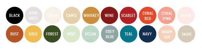
I ended up with 20 colors, which I think is a good number for me. You can do more or fewer if you like. This is really just another chance to play and explore your own tastes.
Next week, we’re going to organize these colors and figure out how to make them wearable.
Resources
There are a lot of interesting tools out there you can use to start thinking about color.
- Kuler is a web-based tool from Adobe that helps you create palettes. Playing around with the color wheel is fun and can help get you going.
- COLOURLovers is another great site for creating and playing with palettes.
- Color Collective is a gorgeous blog with tons of palette inspiration.
- Why not take a trip to the hardware store and pick out some paint chips? Then you’ll have something physical to hold onto as well.
Discussion
What colors make you feel really good when you wear them?
For me, it’s black, tan, and shades of muted and warm pink. I love a good coral.
Comments
sewlittletime
February 13, 2014 #
colour is so important to me. i have lost count of how many times i have bought the “wrong” fabric for a project because i was totally seduced by the colour! i tend to have 2 colour palettes depending on the season, all based around fairly saturated cool colours. my winter palette is jewel toned (burgundy, navy, teal, charcoal) and my summer one tends to the nautical (navy, white, red, turquoise). but i love all blues especially teal and turquoise and my basic neutrals and navy and charcoal grey. i wear far less black than i used to. i had my colours done when i was about 16 (it was the 80s and colour me beautiful held sway!) and i am a cool winter. i still have my little book of swatches. must dig it out!
Becky
February 13, 2014 #
I really like the idea of seasonal palettes–I know that I’m always drawn to different colors in the spring/summer than I am in the fall/winter.
Becky
February 13, 2014 #
Another good how-to on making a color palette is on Crafting a Rainbow– Gillian put together a great tutorial for how to pull colors from your existing wardrobe that you love and turning them into a workable document! It’s here: http://crafting-a-rainbow.tumblr.com/post/61163429028/create-your-own-personal-colour-palette
Sarai
February 13, 2014 #
Nice! I like that she walks you through doing it in a word processing doc too, very clever!
Julia
February 13, 2014 #
I love colors and like wearing them more than neutrals. The dilemma I’m in is that the colours I love most are not flattering on me. I love sunny yellow but I look so sick in it. Hrmpf. I’ve had my colours done years and years ago and turned out a Soft Autumn. And while I can see how healthy and glowing I look in the right colours, I wish I could wear brighter, happier colours. I’ve also realized that garments in muted colours often have drapey or flowing styles, which I don’t like at all. I want crisp and brisk, style-wise and colour-wise.
My two favourite colours to wear are a lighter navy and a certain pinkish red / reddish pink. They make me happy AND look good on me.
Here is my pinterest board where I’ve collected my favourite colours: http://www.pinterest.com/texttussi/colour/
Sarai
February 13, 2014 #
What about incorporating those unflattering colors in small doses, like in jewelry or used as part of a print? Or accessories that are not near your face (like shoes)?
Jen
February 13, 2014 #
I totally agree and this is how I where colors that don’t look good on me near my face or in a big block. I love true red but I never feel right wearing a solid red dress or top, but I feel good in red shoes and even a red stain on my lips seems to work (maybe because it’s sheer). And if a pretty color doesn’t flatter your coloring at all you probably won’t feel good wearing a lot of it anyway. For the most part I subscribe to the color seasons theory and one of its pros is that it may encourage you to experiment with color you never thought you would wear. But overall if you love a color and feel happy when wearing it then I think you should.
Julia
February 14, 2014 #
Sarai, thanks for your comment. Yes, I’ve decided to add some bright yellow shoes to my wardrobe come spring.
I also played with my Colour Me Beautiful swatches and selected the ones that I like best. I’ll add a few colours that I love but are not in my “season” and I think then I’ll have a nice personal palette.
Thanks so much for putting together this series. It’s great and so helpful!
Catherine from Canada
February 15, 2014 #
Yellow shoes are great! It was actually a pair of yellow Fluevogs that began my wardrobe transformation.
Enjoy!
amy w
February 13, 2014 #
I tend to lean toward black, white, red, blue, and purple and stay away from pastels. My last big fabric purchase included all of these colors.
Jet Set Sewing
February 13, 2014 #
I’ve found as I’ve gotten older that color is so important near the face to wake up your complexion. As a 50-something with a 12-year-old, I’m often dressing in the dark to get him to school, but having a colorful scarf to throw on can make a difference in a hurry. I’ve been making Madeleine Vionnet scarves from a pattern in Betty Kirke’s book “Vionnet,” and they’re a great stash-buster because they’re cut on the bias.
sojoysews
February 13, 2014 #
I feel the same way about color near my face. When I was young, I always got compliments when I wore cream-colored tops, but now I can’t get by without a coral or turquoise scarf.
maddie
February 13, 2014 #
No shades make me feel chicer than black and cream. It’s simple, classic, and represents everything I want to feel.
SizeMode
February 13, 2014 #
I have a very rosy complexion, freckles, dark hair and blue eyes. One think I wish I could wear is creamy colors, but alas, I am more vibrant and confident when I wear jewel tones. Blacks: charcol, heather gray
White: winter white, white
Red: brick, bright red (bluish) fuscia, rose, light pink
Yellow: goldenrod
Blue: navy, royal blue, turquoise,
Green: hunter green, dark green, leaf
SizeMode
February 13, 2014 #
One thing I forgot, I have a very emotional/personal connection with the fuscia-leaf green color combination. I was in Afghanistan for 2 years and found that all the children in eastern Afghanistan all wore these colors. Against a monochromatic dark landscape, they were brilliant beacons of vitality. I wear these colors often to honor those kids and remind myself of how I am connected to humanity.
Natacha
February 13, 2014 #
Color is such a complicated thing. Lately, I have been drawn to light apricot and cream like on this coat https://www.etsy.com/listing/171307298/checked-chloe-mod-60s-wool-coat-uk-12-14?ref=favs_view_17 , almond green (like the Coletterie blog background), burgundy (but more on the red side than on the maroon), my first Colette pattern, a Lady Grey, is a beautiful raspberry. My Albion is going to be grey with a lighter grey with gold dots lining. And until now I was more in cold colors like red, or “bleu Klein”…
But maybe I have worn too much black and my life just needs a little bit more colors ;-)
Diane
February 13, 2014 #
I first learned about the Color Me Beautiful system when it came out in the 80s. It answered so many questions for me and made my shopping enormously more efficient. I rarely buy anything outside my palette. Everything automatically goes with everything else, creating many more combinations. Do I occasionally drift a little? Sure. But always come back to those key colors in which I look amazing. I’m a “fall” and my signature colors are a warm red (Pantone color of the year for 2012 – Tangerine Tango) and a very yellowed green. Brown is my black, and oyster white (a slightly green-y ivory) is my white. It’s served me well for more than 30 years. Do I love colors NOT in my palette? Of course. But I want to look my very best all the time. And a pine green or navy make me appear ill.
Sarai
February 13, 2014 #
That’s very interesting and cool. It seems like the most important thing is finding out what works for you, and then sticking with it.
Stephanie
February 13, 2014 #
If you can find one, a paint chip set WITHOUT the names for colors is an interesting tool to wave around in the wardrobe. I’m always attracted to the same colors (used to be quite the monochromatic dresser in my teens – think it was camouflage for body issues). Black, brown, mustard, purple. That rule follows UNTIL I get to the summer dress collection, and then it all goes kaboom. I seem to love novelty prints. I even wear pink (my kryptonite!) in the summer. I’ve been consciously trying to drag some of that riot of color into the other seasons, but it’s sloooow going.
Lisa G.
February 13, 2014 #
Even as a child I was aware that with my sallow complexion, a royal blue would make me look ill. Of course, with make-up, that’s less of an issue (although I still dislike royal blue!).
Green is my favorite color, but that doesn’t mean that I will buy green clothing if it’s available. I may not like the shade – or, I’ve noticed the great difference fabric makes with color. I mean that a certain color might look awful in leather or knit, but lovely in a wool sweater, for example. That’s very interesting, I think.
Thank you for doing this series – it’s very helpful!
Annette
February 13, 2014 #
Color is so subjective, it really does come down to how you feel and how you see yourself in a particular color.
I too had my colors done back in the 80s I got 2 different results. I had a tough time resolving which do I go with. I finally went with the cool summer, I felt more comfortable in those colors. I don’t match exactly with the swatches but go with does this color belong in the group. Sometimes I am right and sometimes wrong in my color selections.
Now what colors do I choose most often. Neutrals are gray and navy with some soft white and stone added to the mix. I wear a lot of blues and blue-greens. Purple is a favorite all shades and my pinks are in shades of Rose. Black is too harsh I do wear black footwear in the winter
Raphaelle
February 13, 2014 #
Blue has been my favorite color for as long as I can remember. My mother will tell you how annoying I was with my desire for everything to be blue! To this day, it’s the color I turn to the most. I buy a lot of blue clothes, blue fabric, blue yarn… My favorite neutral is navy and I can honestly say I have never met a blue I hated. It’s good thing it’s actually a good color for me! Seriously though, I can’t say WHY blue is such a favorite but it makes me happy, or rather, it feels like me.
That isn’t to say I don’t wear or like any other colors though. I love a cool red, bright, dark, it doesn’t matter. Love a good saturated pink too (not bubblegum please). Both red and pink actually work really well with my coloring. I also gravitate toward purples and the cooler shades of green. I have a turtleneck sweater that I never wear anymore but that I’ve kept because the shade of green is perfection for me. Black, white, grey are staple neutrals, second only to navy. Yellows, yellowish greens, browns, warmer reds, and orange don’t look so good near my face so I stay away from them. Every so often though, a fabric in those colors calls to me and it ends up in my stash and I don’t know what to do with it! Should probably make something for my husband. He looks great in orange!
isis
February 17, 2014 #
I’ve also always been drawn to blue. It the most common favourite colour, but for me it was an obsession while at school. I’d dress head to toe in blue and think they were different colours!
Since then I’ve found I go on different blue trips. For a few years it was ice blue, then a few years of teal, then a few of aqua… At the moment it’s navy blue.
Jade
February 13, 2014 #
The colors I feel the best in are ivory, teal (oh, those were my wedding color, how surprising!) and brown. But when it comes to combinations, I love mixing black or gray with a dash of very bright color (red, turquoise, hot pink…). And when summer comes, I become very partial to lemon-lime on a white background (so refreshing!).
I posted my palette on Pinterest here: http://www.pinterest.com/pin/329607266450512607/ . Lots of blues and quite a few purples/pinks (but I am very picky as to the exact shades of purple/pink I feel like wearing or not), and not much oranges or reds, which is a good reflection of my wardrobe.
sojoysews
February 13, 2014 #
I love the idea of a black and cream wardrobe (a la francaise,) but I look sickly without bright colors near my face. I am a true spring with honey-blond hair and blue-green eyes.
Any shade I wear near my face needs some yellow in it–rose, coral, lime, aqua, camel. I save the dark and very pale colors for my lower half or dress them up on top with a scarf or colorful jewelry.
Fiona M
February 13, 2014 #
I’m a soft autumn and I do like the colours on my palette, but I also love some of the really bright, clear colours from the spring palette, which I sometimes ‘borrow’.
I love colour, and always wear some colour near my face, never black or white.
I like to think I have a good eye for colour and am forever giving my friends and colleagues unsolicited advice on their best colurs, I must be soooo irritating!
MTangel
February 13, 2014 #
I love color! Unfortunately for me, I have the sort of coloring that doesn’t wear very many colors well at all. My hair and eyes fit perfectly with Clear Spring coloring (brown hair with red/gold highlights, and green eyes), but my skin has cool undertones that don’t go with those colors. You would think that a person would match themselves, but apparently that’s not always the case.
I wear more of the Soft Summer colors (which I really like). Mostly I wear pink or blue-green (spruce/pine) – they’re my favorites and I’ve even gotten compliments wearing them. I look terrible in yellow or orange. Since I like spring colors too (soft yellow, coral, spring green) I put them in my house instead.
If I’m careful, I can use a little bit of bright color in a belt, or the border of a skirt. A friend did my hair once and put her bright orange flower clip in it. It felt so daring to wear orange! And I was thrilled that it looked good with my hair, even better than the softer colored clips I have – I just have to keep it far far away from my skin.
meganleiann
February 14, 2014 #
I don’t naturally match myself either. I think many don’t. DNA isn’t really concerned with fashion.
My coloring actually sounds similar to yours- similar to Kate Middleton? I have a close friend who is a very accomplished hair stylist who added red highlights to my hair and it changed everything. My coloring made so much more sense to me. I don’t need to wear foundation, I look solidly better in so many colors that just looked decent before. It was SO worth the money to me. I completely understand why so many women spend the money now.
Andrea
February 13, 2014 #
I love light, bright colours. Within that very broad category I really don’t care. Teals, aquas, pinks, corals, tangerines, yellows, marigolds, any bright/light green, orchids, violets–if it looks like spring or summer, I will love it. And I will wear it together. Clashing is totally under-rated. I have a bright red winter coat I wear with a bright pink scarf, pink gloves, and pink boots. My pet theory is that green and blue are the true neutrals, and go with everything. I try not to own or wear black or white, and have just enough grey and beige to allow me to pass successfully in a corporate environment. But I’d rather wear head-to-toe colour.
I tend not to think too much about what’s flattering. Some versions of yellow and orange wash me out, it’s true, but then I just get them in a purse or jacket or skirt. There’s always a way. Otherwise, I just get whatever is colourful, and worry about how to make it “go” later.
Kate
February 13, 2014 #
I’ve recently been thinking about the differences between colours I like and colours I like to wear. A while ago, 3hourspast did a few posts about colours and she said that, along with themes like monotone and pastel, some people like ‘high contrast’. Total lightbulb moment for me. I feel most comfortable when I am dressed in strong colours, with a high contrast, so I basically stick to red, white, black and navy. That’s a bit limited for me, though, so I still have lots of bright accessories and the odd bright top. But I have to make sure it’s going to be the right proportion of contrast with the clothes I already have. I have lots of lovely clothes that I bought because I love their colour, but I never wear because I don’t love to WEAR the colour. I just gave away a lot of grey fabric because I love how it looks but I never wear it.
I love bright colours and also soft pastels, but I just feel out of place when I wear them, so I use them to decorate instead!
Jessi Long
February 13, 2014 #
As I was filling out the questions on the worksheets I kept noting that trends were important to me. However, as I narrowed down my words and answers, I realized a huge part of that is color. When I go shopping, I rarely pick out a color just because I like it that day. I have in my head or on my phone in front of me the pantone trends chart and I usually stick fairly close to it. I feel more confident wearing on-trend, especially if the color is bright and I get a warm fuzzy feeling of satisfaction if the colors I chose end up living on in the pantone palettes for several seasons (I totally saw cobalt blue coming.) For main pieces, I hang closely to my neutrals which change more slowly over time, but the spotlight blouse or a fabulous shoe or accessory is even better for me in the “color of the year”. So I am going to make sure I sew up something in “radiant orchid” for me this spring.
Lucinda
February 13, 2014 #
Alright, I know what I’m doing this weekend: taking a trip to Home Depot to raid their paint chip section, and tearing apart my closet! Oh, and probably some sewing, too ;)
Becky
February 13, 2014 #
One of my core words is actually “colorful”, and I think my printoholic ways reflects that pretty well! I’ve never had my colors done, but I would probably be labeled a warm autumn. I do like those earthy tones, but I like to wear a lot of brighter blues and greens, too! I’ve noticed that my winter wardrobe tends to be rather dull/neutral, and have concluded that I really need to add colors to it because I get bored with it really fast. I just put up a post that has my palette, along with a shot of the majority of my fabric stash to see how the two compare. http://sew-and-so.blogspot.com/2014/02/wardrobe-architect-week-5-colors.html
Brenda
February 13, 2014 #
This post is great, just like the other wardrobe architect posts. Thank you!
I am thinking about David Zyla’s philosophy of using colors on your body to wear in your clothes. This really helped me narrow down the rainbow to something manageable, and the tone of the colors all blend together – burgundy, plum, purple & teal (veins), brown & taupe (freckles & hair color), navy, blue & seafoam (eyes). I don’t wear my red skin tone (red-coral) since I think I look like I worked out too hard and am ready to pass out when I wear it.
Some people would probably find this idea too limiting, but I’ve really appreciated a system that makes intuitive sense and helps me narrow down the choices when I walk into a fabulous fabric store.
Yvonne
February 13, 2014 #
Oh Sarai, you almost spared me the work to make a colour palette for myself. Mine would look like yours just minus the teal and ocean.
Actually I tend to buy a lot of fabric in navy cause it’s kind of my black, it matches with all the other nice (warm) colours I like most.
This topic makes me think of the (cultural) gender aspects of colour, especially in children clothes. My son likes bright colours and pink. But these colours are nowhere to be found in boys clothes because of the stereotypes that are associated with colours. I try to make more clothes for him by myself or buying girls clothes sometimes because it makes him happy. I hope one day children could just have fun choosing the clothes they want without getting comments like “but you’re a boy!”.
geri
February 14, 2014 #
I too love color. several years ago I realized my wardrobe was all black with grey and some white. I have made a conscious effort to add color over the kast several year. I spent considerble time figure out my colors- including color me beautiful, zyla and dressing your truth. I think I have found what works for me, intersting no one sytsem has got me just right. I find color to be very whimsical, some days I love a color and then I tire of it and no longer want to wear it. I do seasonally rotate colors, I wear more burgundy, grey and black in winter and more blue, white and red in summer. I am probably closest to the “deep winter” palllete, as I have olive skin, hazel eyes and ash brown hair. But I can borrow from summer, spring and even some fall palletes. I amde a pinterest board here that showcases some of my favorites. http://www.pinterest.com/gericooper/colors-wardrobe-architect/ Overall my long time favorite is a pale robins egg blue, I have loved that color for ages. My bedroom is painted that color, its one I never tire of.
Julia
February 14, 2014 #
Today when I was grocery shopping I saw a woman at the checkout who had obvisously found her palette. She had everything in purple (except for a white hoodie). Shoes, jeans, jacket, wallet, key fob, glasses frames, even her hair was dyed purple. I would never want that for myself, but I thought it was kind of cool. :-)
Béa
February 16, 2014 #
Heehee- that made me think of this:
http://www.theguardian.com/uk-news/gallery/2013/nov/18/looking-to-mauve-house
Julia
February 16, 2014 #
OMG, the plush cover on the tub just kills me! Hahaha!
cyngehin@gmail.com
February 18, 2014 #
Reminds me of a floral customer I named ‘Lavender Lady’. An elderly woman, with lavender hair, clothing, including lavender raincoat, lavender eyeglasses. She always purchased- Lavender Impatiens for her flower boxes.
Elizabeth
February 14, 2014 #
Thank you for this thoughtful series, I’m enjoying the process of trying to think more strategically about the clothes that I make.
Catherine
February 14, 2014 #
This whole exercise has been so interesting (along with thinking about body-types and silhouettes and realizing that some things are just never gonna work on me, so stop trying…), and especially this about colour.
My aha moments about colour have been:
i) I read once that the French women’s style rule was to “only ever wear one colour; black and white don’t count.” I adopted that rule and it has simplified (sewing and wearing ) my wardrobe so much. (I expanded it to grey in the winter and brown in the summer as well…) It has also meant keeping any patterns simple, which turns out I am more comfortable in anyway.
ii) I have brown hair, pale skin and pale blue eyes. I was always dressed in blue as a child and encouraged to wear blue later because “it suits your eyes.” I finally realized that while I like LOOKING at blue (I collect blue glass) I like WEARING scarlet, persimmon, and saffron.
So my palette is:
Neutrals:
Black
Grey
White
Chocolate brown
Intense Colours:
Cool reds
Deep oranges like persimmon
Deep rich yellows like saffron, mustard (and schoolbus!)
Blue-greens like dark teal
In these colours I feel interesting, bright, elegant, playful and stylish.
PS When my son-in-law went on a business trip to India, I made a business card sized collage of cut-up paint chips (laminated with packing tape) for him to use when buying me silk. My daughter made one too, and he brought home some spectacular fabric!
Mary
February 16, 2014 #
This sounds very much like me! I love neutrals and wear them most of the time, but if I wear color I want deep jewel tones: teal, orange, ruby, midnight blue. Last summer I bought a hot pink dress and it looked fantastic on me.
For a long time I wore no color at all, in part because I’m terrible at matching colors (TERRIBLE) (seriously, it’s like visual tone-deafness), but in part because as a teen I tried lots of colors that made me look sallow and sick. Turns out those ‘safe’ pastel colors weren’t so safe! I’m pale, but my pale skin is olive-toned, so I look great in pumpkin but jaundiced in petal pink.
alice stribling
February 14, 2014 #
Color is my favorite part of getting dressed! I tend to go towards neutrals with most of my tops & bottoms, with pops of color for outerwear, scarves and accessories.
It’s funny because my watercolor choices are pretty much my favorite colors in fashion as well.
http://www.flickr.com/photos/fourfivealice/12108535404/
Super fun, thanks!
Isabel
February 14, 2014 #
Really enjoyed this week’s assignment! Colour is definitively my thing, as I found out when preparing the silhouettes last week and the various mood boards. After many years of living in black, grey and navy mostly, I am all up for it!
The colours that make me feel really great are the primary bold colours that have become my uniform in recent years: yellow (mustard and gold), red and navy, as well as grey and black, which work with all those colours. In the summer I tend to go form a more varied palette and lighter tones, but in winter it is bright colours all the way!
I created a Pinterest board including a presentation for those colours and a few others, as well as representative images for each.
http://www.pinterest.com/craftysci/wardrobe-architect-colour/
Liliana
February 15, 2014 #
I was happy to see that the colours that I like and the ones that were represented in my pictures also played an important role in my actual closet: From black to white, navy, teal, a blue-ish, dark purple and copper. But I also realized that the clothes are too monochrome – too many items in a very similar (if not the same) shade… That made them look somehow boring… I think I need more variations and should incooperate some lighter shades and also try some new colours like red or dark green in small doses!
Kate McIvor
February 15, 2014 #
I love the colors your selected for yourself, Sarai! I think artists like you can do a good job selecting their own colors. Those of us who are less artistic (like me) can really benefit from getting our “colors done.” I have gotten my colors done twice — once in my 20’s and once in my 40’s. It has really helped me stop buying clothes and fabrics that will never work. You can see my colors here: http://theconfidentstitch.com/blog/2014/2/15/wardrobe-architect-week-5-my-color-story. I’m a “contrasting winter.” :)
Sarai
February 17, 2014 #
You raise a good point, that some people might be more visual or color oriented, or have a background that allows them to think differently about color (such as commenter Tiffany below, who mentions learning about color in architecture school).
Still, I don’t think there are “artists” and “non-artists”. I believe we’re all capable (maybe in different ways, to different degrees) of seeing the world in new and creative ways, and that’s what art is to me. It’s just a personal filter on the world that you share with others.
Great discussion!
Dink
February 16, 2014 #
My favorite colors to wear are definitely mood oriented!
For fun I like: bright pink on the coral side or, or dark blue pink
For feeling pretty I like: Lavender, a red purple/plum, or forest green
When I need to feel extra professional: Navy or gray
I made a huge effort this fall to “adult” my wardrobe, and one of my goals was to not buy anything black. I always had a lot of it because I’m cheap and I wanted everything to go together. But always wearing a black top was kind of depressing and it’s not my best color either. I look better in basically any other neutral in existence- haha!
I’ve never been able to figure out what “season” I am- I’m going to go check out all those links!
Lise
February 16, 2014 #
This exercise was SO much fun! The concept of high and low contrast, from Brenda Kinsel’s book ‘Fashion Makeover,’ also help in creating my palettes. I learned that I’m pretty much high contrast – deep base tones with colorful and neutral accents. And although I’ve always thought of myself as a ‘cool’ color person, I ended up with quite a few warm accent tones. Sharing my palettes here: http://www.colourlovers.com/lover/lmpneely/palettes; I’d love to hear your comments.
isis
February 17, 2014 #
I’ve always felt ‘not right’ in black and/or white. They are just too stark for me. I’m sad it’s taken me until I’m thirty to work this!
Just think of all those silly articles in magazines that tell you the “Top 5 classic items every girl needs in their closet” – They only ever included black and white (and maybe a cream sweater if lucky). But I certainly didn’t want just black and white, I wasn’t interested in them, I felt silly in them AND they looked like what I had to wear to all my waitressing jobs!
Sasha
February 17, 2014 #
I love color; I love the way a certain color can influence my mood, can alter my disposition … but I prefer not to be dressed like a pop painting. So, I tend to use color in “small doses” as accent color together with my favourite neutral colours (cold shades of grey or blue or warm shades of tan), thinking contrast, complementarity and of course mood. And this applies even in a fucsia t-shirt over a pair of jeans, dark blue converse sneakers and white cotton cardigan scheme, which, most of the time, is just fine for my lifestyle.
Tiffany
February 17, 2014 #
this was a wonderful article. one thing i love about my experience in architecture school is how awesomely, though painfully, we were taught about color and how to use it. it truly is a language in it’s own and contains such wonderful symbolism.
Shell
February 19, 2014 #
I feel especially great in greens – as a red head I don’t know how much is because I feel like they “suit” my colouring versus how much I have a calm, natural garden type connection to them, both aspects are true. I’ve worked out some other colours for me for this year and blogged them in Jan, so can’t wait for the next installment.
Tiffany
February 19, 2014 #
I love the colorus you picked – they are similar to mine. I used vintage maps as my colour inspiration. This is fun seeing what everyone else picked.
krystina
February 20, 2014 #
Sarai, Which site did you use to create your palette? I would love to create one of my own!
Sarai
February 20, 2014 #
I just made my circles in photoshop! I think you could do the same in any type of graphics program, or even powerpoint, microsoft word, or apple pages.
Amy
February 20, 2014 #
I’m a little late but I had so much fun putting this pattern together! Can’t wait to group it. Great series – keep it up!
You can see my blog post about my color story here:
http://www.ladymockingbird.com/2014/02/wardrobe-architect-my-color-story.html?m=1
Sarah O
March 1, 2014 #
I just blogged about my color theory here:
http://ohsaraho.blogspot.co.uk/2014/02/the-wardrobe-architect-week-5-color.html
Jeanette
March 10, 2014 #
I ended up using my favorite yarn stores widest color range to pick out my colors
http://www.knitpicks.com/yarns/Palette_Yarn__D5420132.html?buy_individually
The Sewing Man
April 15, 2014 #
Hello,
As a french sewer and blogger I’ve discovered recently this project and many blogs in France are now involved in ! As the srping is arriving , I’ll try to think about this for my man wardrobe. Thanks for these thoughts that makes us think more deeply our sewing projects.
Diego
May 23, 2014 #
I know this if off topic but I’m looking into starting my own blog
and was curious what all is needed to get
setup? I’m assuming having a blog like yours would cost a pretty penny?
I’m not very internet savvy so I’m not 100% positive.
Any tips or advice would be greatly appreciated. Thank you